Gilding the Lily
Covers.
Every book needs a cover. And the cover is obviously a huge selling tool. If you’re an indie writer/publisher like I am, it might be the only tool you have, that first grabber moment that gets a potential reader’s attention.
However, in my case, it’s another detail I have to come up with myself. Art staff – me. Design staff – me. Photoshop specialist – me.
I had an odd experience recently. I went out to New Jersey to sell some copies of ‘Green’ to an audience of horse lovers (there’s a substantial subplot in the book involving horses and fox hunting, believe it or not). ‘Green’ takes on several subjects and horses is only one among many, but the response I got from the people who wandered up to my table of books was puzzlement.
Huh?
“Disregard the cover; the book really is largely about horses,” I ended up having to explain to almost everyone who came by. “If I’d known I was coming here, I’d have put a horse on the cover.” Yes, I know Di, you told me so.
‘Green’ was a tough cover to design, simply because there are so many threads to the story and so many of them reduce so easily to cliche. The book is essentially a romantic comedy with horses and politics. It takes place in Ireland a week before the beginning of the Iraq War.
If I’d gone to a publisher and the inevitable focus group (that’s assuming they care enough about your book to have a focus group), I so easily could have ended up with this:
Of course, this wouldn’t fit my book because my main character is middle-aged – the abs he has, you don’t put on a book cover – and the woman is either 44 and gorgeous (for her age, but not necessarily book-cover-fantasy material) or 37 and punky-charismatic (again, not a fantasy cover – and book covers like this are all fantasies, let’s face it).
If I was Nora Roberts, I could end up with this:
Which really is the cover I should have had at the horse benefit. But this cover only works because it’s Nora Roberts, who already has a following. All you do is put her name on the cover and give it a nice rustic field so everyone knows this is ‘the Irish one’. My books have to grab your eye in a thumbnail on a web page, so something has to MAKE you notice.
So go back to my cover again. I started out with this, which is actually surprisingly like Nora Roberts’ cover:
It was pretty clearly Ireland, it had a little incongruity with the castle in the middle of the field and it had a horse. The field and sky were one picture, the horse a second and the castle wall a third.
But it just didn’t grab my attention, at least not at thumbnail size. Static, not attention-grabbing.
So….hmmm….
Next…
I had just finished rewriting the book (that’s another blog post in itself). The story ends at Shannon Airport the night the war in Iraq began, as airplane after airplane of soldiers and cargo were being shipped through Ireland’s (relatively) peaceful gateway, against the wishes of many outraged Irish. So suddenly I had the idea for the transport plane. I got the biggest honking picture of a transport I could find and threw the horse into the field.
Which just didn’t work. Too much. Too busy. No room for the title and my name (I’m willing to be humble at appropriate times but my name is going on the cover, dammit!).
So…
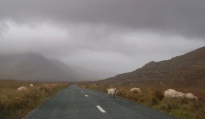
I liked this. An innocent Irish sheep in a Connemara field. If I added a transport to this…
We get…
 The sheep is twice the size it is in the original picture, the transport is a total Photoshop job. It’s bizarre, it’s incongruous, it’s…attention-grabbing. Even with the horsey audience, it did its job. Everyone that came by that desk stared at it long enough to go ‘Huh?’ Which is all it was intended to accomplish. And it does fit the book, though you have to get to the end to understand why.
So I guess I’m happy with what I have. If I’d gone through the focus group, I’d have so much work to do on my abs…
 |
Click here to purchase on Amazon. |
 |
Other e-readers, click here for Smashwords. |
 |
Click here for trade paperback. |


